How Japanese Consumers Read an Alcohol Label (and Why It Affects Sales)
 By
By 
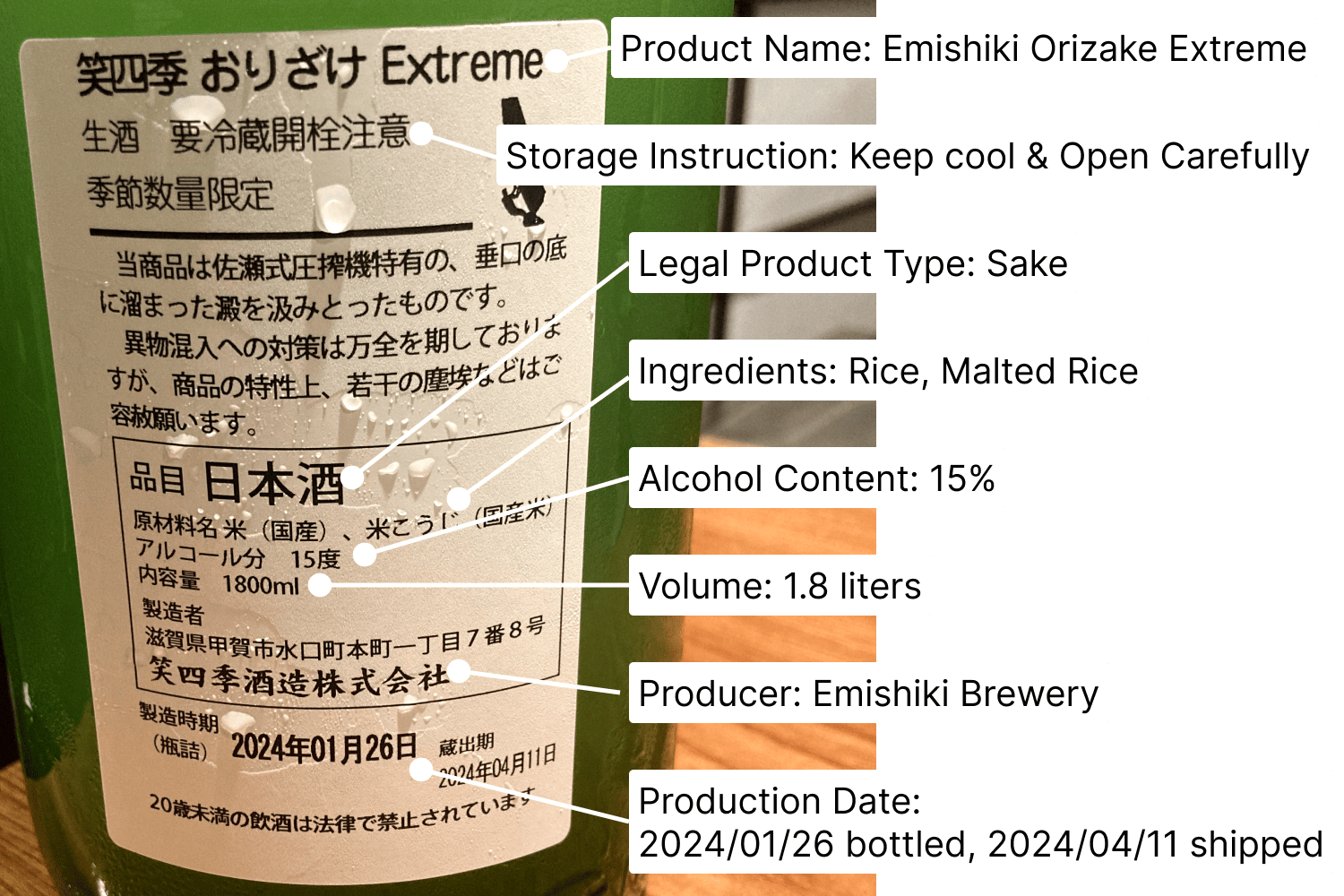
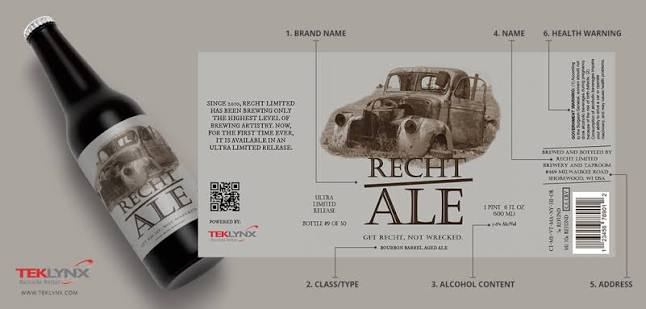
Everything covered so far in this series has focused on what an alcohol label legally must say. This post shifts to a different but equally important question: how Japanese alcohol label perception forms. It also looks at what this means for labels designed to sell.
What Japanese shoppers look for first

The direct answer up front
Japanese alcohol shoppers often look for clear origin information, quality signals, and a clean visual presentation. Detailed tasting notes and brand stories usually come later. First, shoppers form an impression from the label’s appearance and origin cues.
What the answer depends on in practice
The pattern varies by shopping context. A specialty retail purchase usually involves more attention to detailed label information. E-commerce and general retail decisions often happen faster. In these settings, visual presentation and immediately visible information can matter more.
A concrete example for a foreign brand
A shopper in a specialty wine shop may examine appellation, vintage, and producer information. These details support a considered purchase. However, an e-commerce shopper may first notice the product image and headline information. They then decide whether to explore the listing further.
Trust signals on the label
What the regulation requires
Mandatory disclosures remain essential, as covered throughout this series. However, the label’s overall presentation also matters. Clean formatting, accurate information, and professional design can create a strong trust signal.
A Japanese consumer may not consciously assess compliance. Still, they can notice whether a label looks credible and well made.
The most common compliance gaps
A label can meet legal requirements and still look poorly finished. A rushed sticker can create this impression. Mismatched fonts can also make the original and Japanese text look disconnected.
Dense mandatory information can create another problem. It may crowd out the brand’s main visual message. As a result, the label can appear cluttered even when every required detail is present.
How localization handles it
Good localization considers visual coherence as well as legal compliance. The finished label should look clean and intentional. It should also integrate Japanese information naturally into the original design.
A compliant label with strong visual organization can do more commercial work than a label that simply meets the legal requirements.
Origin and craft cues
What a foreign brand needs to understand
Japanese consumers in a quality-focused market can respond strongly to clear origin and craft signals. Specific details often provide more useful context than generic quality claims.
These details might include a production region, named producer, or specific production method. They give consumers something concrete to evaluate.
How it plays out in the import process
This reinforces a key point from the series. Specific and accurate origin information can support both compliance and commercial communication.
The same applies to genuine production details. They offer useful product information without relying on broad health or quality claims.
The practical takeaway
Build your label’s visual and informational hierarchy around specific, credible details. Lead with origin, producer, and production information where these details are relevant. Avoid relying too heavily on generic marketing language.
Price-tier perception

The variables that drive the number
Label design can influence how consumers perceive a product’s price tier. Information density and visual quality can both affect that impression.
A polished label can support a premium positioning. A generic or poorly localized design can weaken that positioning. This can happen even when the product itself has strong quality.
A realistic range, not a firm quote
The effect varies by category and execution. Therefore, this post cannot quantify the commercial impact in general terms.
However, label design can play a role in price-tier perception. It should not be treated as a purely aesthetic issue.
Why a label and SKU review is needed to be precise
Your specific label needs individual review. The design should match the intended price tier and product positioning.
A reviewer familiar with Japanese alcohol labels can assess this relationship more precisely. General design principles only provide a starting point.
Information density expectations
What a foreign brand needs to understand
Japanese consumers, especially in specialty retail, may be comfortable with detailed product information. Appellation details, production information, and tasting notes can add value when the design presents them clearly.
However, more information does not automatically mean better communication. Organization remains important.
How it plays out in the import process
Mandatory Japanese-language additions do not always need to compete with marketing content. A well-planned label can accommodate both.
The key is to create a clear visual hierarchy. Mandatory information and useful product details should each have an obvious place.
The practical takeaway
Do not assume that you must remove useful marketing information to make room for mandatory disclosures. Instead, organize the available space carefully.
Japanese consumers may appreciate detailed information when the label remains easy to read. The goal is not less information. The goal is better organization.
Designing for the Japanese eye
What a foreign brand needs to understand
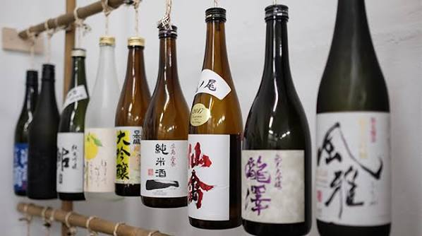
Visual conventions also affect Japanese alcohol label perception. Font choices, layouts, information hierarchy, and the interaction between Japanese and Latin scripts can all influence how a label reads.
A design that works well in the brand’s home market may not translate perfectly to Japan. Japanese consumers may interact with the information differently.
How it plays out in the import process
Simply translating a home-market label may satisfy compliance requirements. However, it may not create the strongest commercial presentation.
Thoughtful localization adapts the design as well as the language. It considers how Japanese consumers scan information and interpret visual cues.
The practical takeaway
Treat visual localization as a separate consideration alongside legal compliance. A label review should check more than mandatory disclosures.
It should also consider how the finished design looks and reads to Japanese consumers. This combined approach helps create a label that works both legally and commercially.
Make your label work in Japan
Getting your alcohol label ready for Japan requires more than checking legal requirements. Consumer perception also matters.
A strong review considers compliance, localization, visual hierarchy, and commercial positioning together. This approach helps your label communicate clearly while maintaining its intended brand identity.
Tell us about your product and SKU range through our contact form. We can review where your brand stands for Japan entry.
If you prefer email, you can also reach us at su*****@*******nt.com.