Designing a Label That Sells in Japan and Still Passes Compliance
 By
By 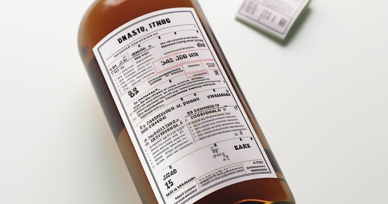
Getting label design japan alcohol work right means solving two problems at once that don’t naturally cooperate: a label has to sell on a shelf and satisfy two regulatory frameworks simultaneously. Brands that treat these as sequential — design first, compliance later — usually end up redoing work. This post covers how to design for both from the start.
Balancing brand and regulation
What a foreign brand needs to understand
A Japanese label has to carry mandatory Japanese-language information under the Food Labeling Act and Liquor Tax Act — ABV, net volume, ingredients, importer name, country of origin, and the under-20 warning — while still functioning as marketing material that has to earn attention on a shelf. These two requirements aren’t naturally in tension, but treating compliance as an afterthought to a finished brand design usually creates one.
How it plays out in the import process
The labeling-method notification, filed with the tax office, reviews the label as it will actually appear — meaning a design that looks clean in concept but crowds out required elements, or shrinks them to the point of illegibility, won’t pass review as submitted. This is discovered during the notification process, at a point where late fixes cost real time.
The practical takeaway
Design with the mandatory elements as a known constraint from the first draft, not as text to squeeze in once the “real” design is finished. A label built around its compliance requirements from the start almost always looks more intentional than one where compliance was added later.
Where compliance text can live
What a foreign brand needs to understand
Mandatory label information doesn’t have to dominate the front of the bottle — much of it, including ingredient lists, importer details, and some regulatory disclosures, can live on the back label, while the front label carries the brand’s visual identity and primary marketing message.
How it plays out in the import process
What has to appear where, and in what minimum size or format, is governed by Food Labeling Act and Liquor Tax Act requirements that vary somewhat by exact element — the under-20 warning, for instance, typically needs to be clearly legible regardless of placement. The specific placement and sizing rules for each required element should be confirmed against current NTA and consumer affairs guidance during label review [VERIFY].
The practical takeaway
Reserve the front label for brand storytelling and push as much mandatory text as regulation allows to the back label, where it can be organized clearly without competing with the visual identity that’s actually doing the selling.
Visual hierarchy for Japanese shelves
What a foreign brand needs to understand
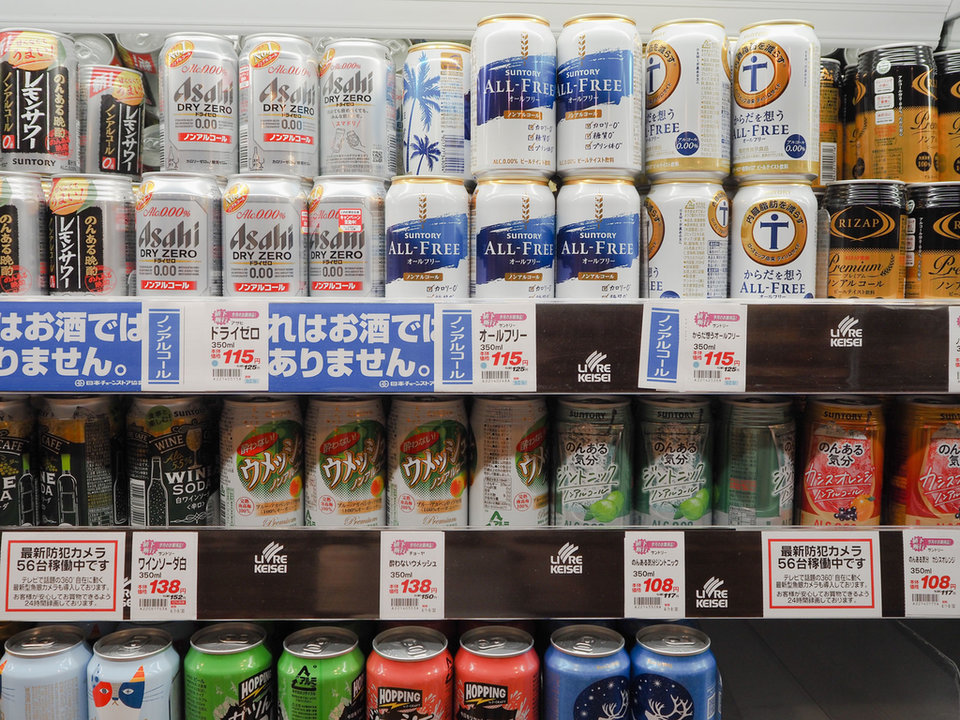
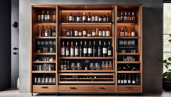
Japanese retail shelves, particularly in specialty and premium alcohol retail, tend to be dense with product, and a label competing for attention there benefits from a clear visual hierarchy — one dominant brand element, rather than several competing for the same attention.
How it plays out in the import process
This is purely a design consideration rather than a regulatory one, but it interacts with compliance requirements in a practical sense: a label with too many competing visual elements often has less room left to place mandatory text cleanly, which can create compliance friction that a simpler hierarchy would have avoided.
The practical takeaway
A label with one clear focal point — the brand name, a distinctive mark, or a single striking visual — tends to perform better on a Japanese shelf and, as a side benefit, leaves cleaner space for the required Japanese-language elements.
Premium cues that resonate
What a foreign brand needs to understand
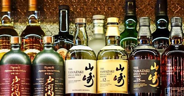
Because Japan’s alcohol market rewards premium positioning over volume, visual cues associated with quality and craft — restrained color palettes, quality paper or embossing where the format allows, clear provenance information — tend to resonate more with Japanese consumers than bold, loud packaging built for shelf-shouting in a volume-driven market.
How it plays out in the import process
These design choices don’t interact directly with the regulatory process, but they do interact with the brand-story fit that determines how well a product performs once it clears the border — a label that looks premium and a brand story that reads as premium reinforce each other at the point of sale.
The practical takeaway
If your product is positioned as premium, make sure the label design actually signals that in a way a Japanese consumer recognizes — this is one of the areas where design choices that work in a home market don’t automatically translate to what reads as premium in Japan.
Avoiding clutter
What a foreign brand needs to understand
The combination of translated marketing copy, mandatory regulatory text, and a brand’s existing visual elements can easily produce a cluttered label if each is added without editing the others — a common outcome when localization is treated as addition rather than integration.
How it plays out in the import process
A cluttered label isn’t itself a compliance failure, but it often signals rushed localization work, and clutter makes it harder to verify that every mandatory element is present, correctly formatted, and legible during compliance review — increasing the odds something gets missed.
The practical takeaway
Treat localization as an edit, not an addition — some marketing copy from the home-market label may need to be shortened or cut entirely to make room for mandatory Japanese text without creating clutter. A tighter label usually localizes more cleanly than a dense one.
Working design and compliance together

What a foreign brand needs to understand
The brands that get through this process most smoothly are the ones where design and compliance review happen together, informed by the same understanding of the product, rather than a designer working in isolation and handing off to a compliance check at the end.
How it plays out in the import process
A coordinated approach means design decisions account for mandatory element placement and sizing from the first draft, which reduces the revision cycles that otherwise happen when a finished design gets sent back for compliance fixes — and it means the labeling-method notification is filed against a label that was built to satisfy it from the start.
The practical takeaway
Choose a partner who manages design and compliance as one connected process rather than two separate vendor relationships you’re coordinating yourself. That structural choice is often the single biggest factor in whether label work finishes in one pass or several.
Every label ultimately has to work for your specific product, brand, and SKU count — which is exactly what a real design-and-compliance review is for.
Tell us about your product and SKU range through our contact form, and we’ll review where your brand stands for Japan entry. If you prefer email, you can also reach us at su*****@*******nt.com.